Overview
The flexibility of Tailwind CSS meets the convenience of PrimeVue components.
Idea #
At PrimeTek, we have been developing UI component libraries for 20+ years. Despite the rapid technical enhancements in web, the requirements have not changed significantly. Developers are still expected to build UIs with reusable UI components like dropdowns, tabs, tables, modals and so on. Some teams prefer to use 3rd party UI libraries to save time so that they can focus on the application requirements whereas developing an in-house library may also be preferred to be in full control. We are aiming to find the best of both worlds, a 3rd party UI library that is easy to tune and customize as if it were an in-house library.
The most common variable in this equation is styling, for example a modal dialog is a familiar UI item in applications, the main requirements are to be displayed as an overlay and be accessible. Although the requirements are same, the UI and UX would vary depending the design used in the application due to the subjective nature. This is the main idea of an unstyled core, following the same example, PrimeVue Dialog component provides a functional pattern out of the box while giving you the complete liberty on styling.
Traditional UI libraries have opinionated styling APIs, some prefer to even base it on a design system like Material. These APIs only permit customizing the opinions as they only allow what you can customize and at some point will get in your way. PrimeVue is styled by default, with the upcoming v4 it will also provide a new theming API that is designed to be customizable without restrictions however the unstyled mode of PrimeVue is the key in case you'd like take the freestyle approach without the need to learn new theming APIs.
Tailwind is a perfect fit for the unstyled mode of PrimeVue, as it is also unopinionated unlike Bootstrap. There is no btn class in Tailwind, instead it provides the building blocks e.g. utilities to build your own button. PrimeVue takes this approach to the next level by styling the components with Tailwind utilities, so instead of using a class like .p-button to style a Button, styling is done with Tailwind utilities that are served as presets.
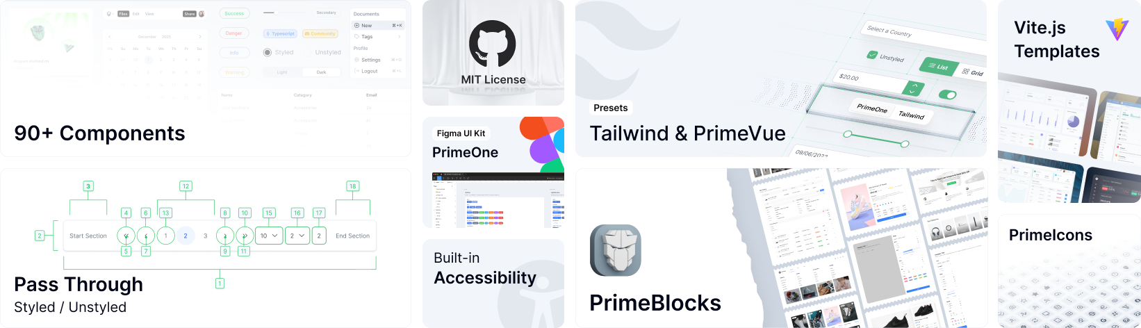
PassThrough #
The PassThrough props is an API to access the internal DOM Structure of the components. Each component has a special pt property to define an object with keys corresponding to the available DOM elements. A value of a key can either be a string, an object or a function that returns a string or an object to define the arbitrary properties to apply to the element such as styling, aria, data-* or custom attributes. Every component documentation has a link to the main website to document the available section names exposed via PT.
Local #
This example styles a InputText component by passing the Tailwind utilities to the input element, since PrimeVue is in unstyled mode .p-inputtext class does not exist at all.
<InputText :pt="myInputStyle" />
Reuse #
The set of the utilities can easily be converted to a reusable class using the @apply directive of Tailwind if you'd like to reuse them in your application. Note that, the built-in presets do not follow this approach for reuse as it would mean creating opinionated Tailwind components whereas focus of PrimeVue is creating Vue components. Also it would require us to naming class names and as we all know developers are not good at naming things.
<style scoped>
.myTailwindInput {
    @apply bg-gray-100 dark:bg-gray-950 p-4 text-gray-900 dark:text-gray-50 rounded-full placeholder:text-gray-500 border border-transparent;
}
</style>
Global #
PassThrough configuration for each component type can be defined globally with the pt option of PrimeVue.
import { createApp } from "vue";
import PrimeVue from "primevue/config";
const app = createApp(App);

app.use(PrimeVue, {
    pt: {
        inputtext: {
            root: 'bg-surface-50 text-surface-900 ...'
        }
        panel: {
            //...
            header: {
                class: 'bg-primary-400'
            }
        },
        autocomplete: {
            //...
            input: {
                root: 'w-16rem' // OR { class: 'w-16rem' }
            }
        },
        //...
    }
});
Override #
A global configuration can be overriden with the local pt configuration in case you'd like to change the style of a particular component.
<InputText :pt="myInputStyle" :ptOptions="{mergeSections: true, mergeProps: false}">
Preset #
A Tailwind CSS preset is a pass-through object to style PrimeVue, the components are not aware of Tailwind in core as the utility classes are injected via pt. This makes the architecture flexible as another CSS library like UnoCSS or Bootstrap can be used instead of Tailwind.
The release bundle contains two built-in presets; lara and aura. In the future, more presets are planned e.g. for Material Design. The presets are implemented for you to use as a base to build your own, you may use them as they are or use them as reference when creating your own design. A preset can only for a single component or multiple, visit the Gallery to view the community driven presets. Releases of presets are not published to NPM as copy-paste approach is a more suitable strategy for easier customization instead of an imported module from node_modules.
import { createApp } from 'vue';
import PrimeVue from 'primevue/config';
import Lara from '@/presets/lara';

const app = createApp(App);
app.use(PrimeVue, {
    unstyled: true,
    pt: Lara
});
Presets are reactive, as a result changing the configuration reskins the entire UI suite. This allows switching the design system at runtime e.g. from Material Design from Google to Fluent of Microsoft with a single line instead of rewriting the application with another UI library.
import Lara from '@/presets/lara';
import Aura from '@/presets/aura';
import { usePrimeVue } from "primevue/config";

const primevue = usePrimeVue();

primevue.config.pt = Lara;
//or
primevue.config.pt = Aura;